- Measuring Growth
- Reports
- Roster Verification (RV)
- Getting Started
- Specifying Instructional Responsibility
- All Actions by Role
- All Actions for Teachers
- All Actions for School Administrators or Roster Approvers
- Manage teachers' access to RV
- Assign other school users the Roster Approver permission
- View a teacher's rosters
- Take control of a teacher's rosters
- Mark rosters as eligible or ineligible
- Add and remove rosters for a teacher
- Copy a roster
- Apply a percentage of instructional time to every student on a roster
- Batch print overclaimed and underclaimed students
- Remove students from a roster
- Add a student to a roster
- Return a teacher's rosters to the teacher
- Approve a teacher's rosters
- Submit your school's rosters to the district
- All Actions for district admin or district roster approvers
- Assign other district users the Roster Approver permission
- Take control of a school's rosters
- View a teacher's rosters
- View the history of a teacher's rosters
- Edit a teacher's rosters
- Mark rosters as eligible or ineligible
- Add and remove rosters for a teacher
- Copy a roster
- Apply a percentage of instructional time to every student on a roster
- Batch print overclaimed and underclaimed students
- Return a school's rosters to the school
- Approve rosters that you have verified
- Submit your district's rosters
- Understanding the RV Pages
- Viewing the History of Actions on Rosters
- Additional Resources
- Admin Help
- General Help
Scatterplots
Interpreting the Data
Scatterplots illustrate the relationship between two variables, such as achievement and growth. Specifically, scatterplots enable you to visually examine the relationship between the variables and answer the question, "As variable A changes, what happens to variable B?" In the case of achievement and growth, you might ask, "As the average achievement of students in a school increases, does the average growth also increase?" In other words, is there a relationship between achievement and growth?
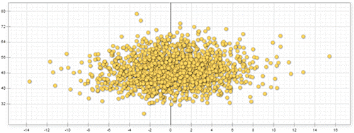
When data points on a scatterplot are distributed somewhat symmetrically along a horizontal or vertical line, there is little to no relationship between the selected variables.
No Relationship

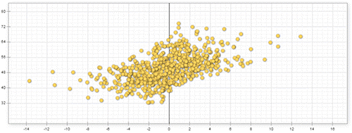
Additionally, a more diagonal pattern indicates that the variables are related. The closer the pattern is to a diagonal line, the stronger the relationship.
Variables are positively correlated if one variable increases or decreases as the other variable increases or decreases. A good example of positive relationship is that of temperature and the sale of ice cream. As the temperature rises, ice cream sales rise with it.
Positive Relationship

Variables are negatively correlated if they move in opposition to each other. In other words, when one increases, the other decreases. For example, as the temperature goes up, sales of hot chocolate go down.
Negative Relationship

When interpreting the relationship between two variables on a scatterplot, it's important to remember that correlation does not prove causation. If variable B increases as variable A increases, that does not necessarily mean that changes in variable A caused the changes in variable B. Also, if the graph contains only a small number of data points, a correlation might be suggested that does not exist in a larger set of data.
For example, if we were to create a scatterplot of achievement vs. growth in fifth-grade Math and we included only a few schools, the relative achievement and growth of those schools would determine the correlation that is suggested in the graph. We might mistakenly conclude that achievement and growth are positively correlated if the selected schools that serve a lower-achieving population of students haven't had great success in helping those students make growth, and the other schools serve a higher-achieving population of students and have had great success with student growth. In other words, we might believe that schools serving lower-achieving students cannot achieve high growth.
However, comparing only a few schools might not offer a fair representation of the true relationship between achievement and growth. If we added all the schools in the state to the scatterplot, we would see little to no relationship between the two variables. With that in mind, it's important to be careful when drawing conclusions from small amounts of data on a scatterplot.