- Measuring Growth
- Public Reports
- Restricted Reports
- Teacher Reports
- Student Reports
- Comparison Reports
- Roster Verification (RV)
- Getting Started
- Specifying Instructional Responsibility
- All Actions by Role
- All Actions for Teachers
- All Actions for School Administrators or Roster Approvers
- Manage teachers' access to RV
- Assign other school users the Roster Approver permission
- View a teacher's rosters
- Take control of a teacher's rosters
- Mark rosters as eligible or ineligible
- Add and remove rosters for a teacher
- Copy a roster
- Apply a percentage of instructional time to every student on a roster
- Batch print overclaimed and underclaimed students
- Remove students from a roster
- Add a student to a roster
- Return a teacher's rosters to the teacher
- Approve a teacher's rosters
- Submit your school's rosters to the district
- All Actions for district admin or district roster approvers
- Assign other district users the Roster Approver permission
- Take control of a school's rosters
- View a teacher's rosters
- View the history of a teacher's rosters
- Edit a teacher's rosters
- Mark rosters as eligible or ineligible
- Add and remove rosters for a teacher
- Copy a roster
- Apply a percentage of instructional time to every student on a roster
- Batch print overclaimed and underclaimed students
- Return a school's rosters to the school
- Approve rosters that you have verified
- Submit your district's rosters
- Understanding the RV Pages
- Viewing the History of Actions on Rosters
- Additional Resources
- General Help
Teacher Value-Added
Interpreting the Data
When you first access the Teacher Value-Added report for a single grade and subject or course, the graph displays each growth index value in the appropriate effectiveness level.
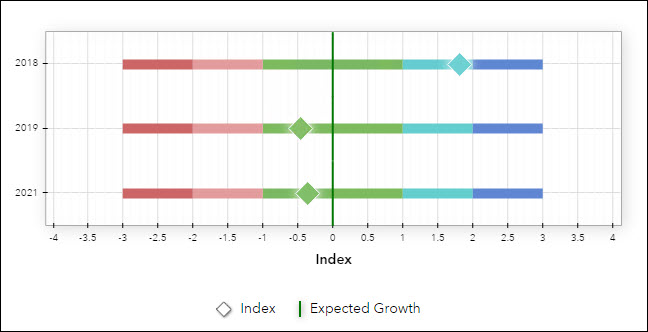
The growth index is the most robust measure of the growth a teacher's students made, on average, because it incorporates both the growth measure and its standard error. Growth index values across all grades, subjects, and courses are on the same scale, which allows for direct comparison.
To better understand how the standard error and growth measure are used together to determine the growth index, it can be helpful to view the Growth Measure Graph rather than the Growth Index Graph. Select the Growth Measure Graph from the Show menu below the graph itself.
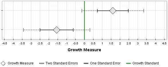
In this graph, each growth measure is marked with a diamond. This value represents the amount of academic growth the teacher's students made in this grade and subject or course. On either side of the growth measure, you'll see marks for one and two standard errors. These marks create a confidence band around the growth measure.
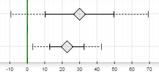
If the entire confidence band range of two standard errors is above the green line, we can say there is a significant amount of evidence, on average, that the teacher's students exceeded expected growth. (This can be seen in the bottom row of the graph above.) If most but not all of the range is above the green line, there is moderate evidence that the group exceeded expected growth. (This can be seen in the top row of the graph above.) Specifically, if the growth measure is between one and two standard errors above the green line, we can say the evidence that the group of students exceeded the standard is moderate. Specifically, if the growth measure is between one and two standard errors above the green line, we can say the evidence that the group of students exceeded the standard is moderate.

Likewise, if the entire confidence band range of two standard errors is below the green line, we can say there is a significant amount of evidence, on average, that the teacher's students fell short of expected growth. (This can be seen in the bottom row of the graph above.) If most but not all of the range is above the green line, there is moderate evidence that the group fell short of expected growth. (This can be seen in the top row of the graph above.) Specifically, if the growth measure is between one and two standard errors below the green line, we can say the evidence that the group of students fell short of the standard is moderate.
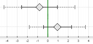
If the growth measure is within one standard error above or one standard error below, the evidence suggests that the group of students, on average, met expected growth. In other words, they maintained their achievement level relative to the state distribution.
If you have reports for multiple subjects or years, it can be helpful to consider all of the data together. It's important to use the growth index values for this comparison rather than expected growths. By themselves, the growth measures do not account for the amount of evidence around the estimated growth. Also, depending on the combination of subjects and courses, the growth measures might be on different scales (state NCEs versus scale scores).
In contrast, the growth index is based on both the growth measure and its standard error. In addition, the growth index values for all tests, subjects, and grades are on the same scale, so direct comparisons are appropriate. If students made more growth in one subject than in another, you might want to reflect on what factors could have led to the different amounts of growth across subjects. If you have data for multiple years, you'll want to consider whether growth across years has increased, decreased, or remained about the same.